If Pâtisserie and Creative Studio Interiors
If Pâtisserie and Creative Studio Interiors
INTRODUCTION
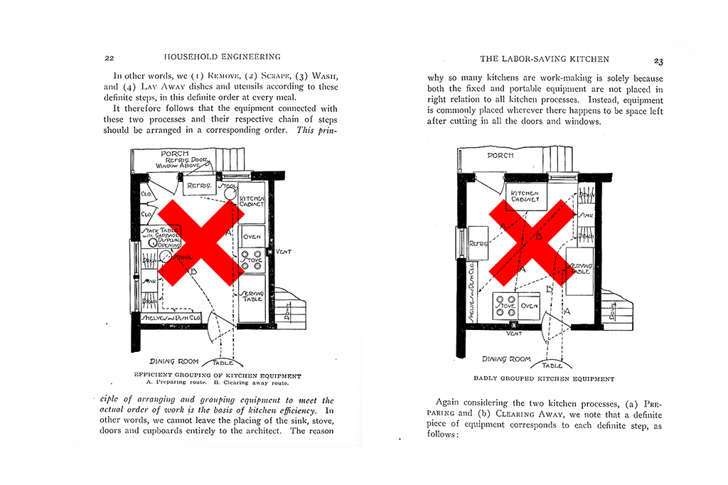
The idea of a kitchen has not evolved since the Industrial Revolution. The last major event in the evolution of food preparation space is the Frankfurt Kitchen, devised by Austrian architect Margarete Schütte-Lihotzky in 1926 for the New Frankfurt Housing Projects in Frankfurt am Main, Germany. For the first time, the kitchen was conceived as a specialized workspace, designed around its functions and Taylorist principles of efficiency and workflow optimization. Almost a century later, the act of food-making is synonymous with performance and high culture as consumers become increasingly attentive to sources of ingredients and the culinary skills that handle them.
CONTEXT/OBJECTIVES
The client is an accomplished pâtissière trained in Japan who uses seasonal ingredients from Taiwan and Japan. Thus, her work is highly customized and require close collaboration with her clients. Occasionally she would hold classes and require the space to accommodate small groups without sacrificing the intimate nature of her interactions. Ideally, the distance between her and her students are minimized. Lastly, the public and private spaces must be clearly delineated without the loss of spatial qualities and clarity.
STRATEGY
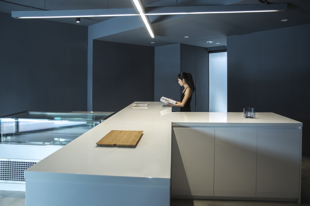
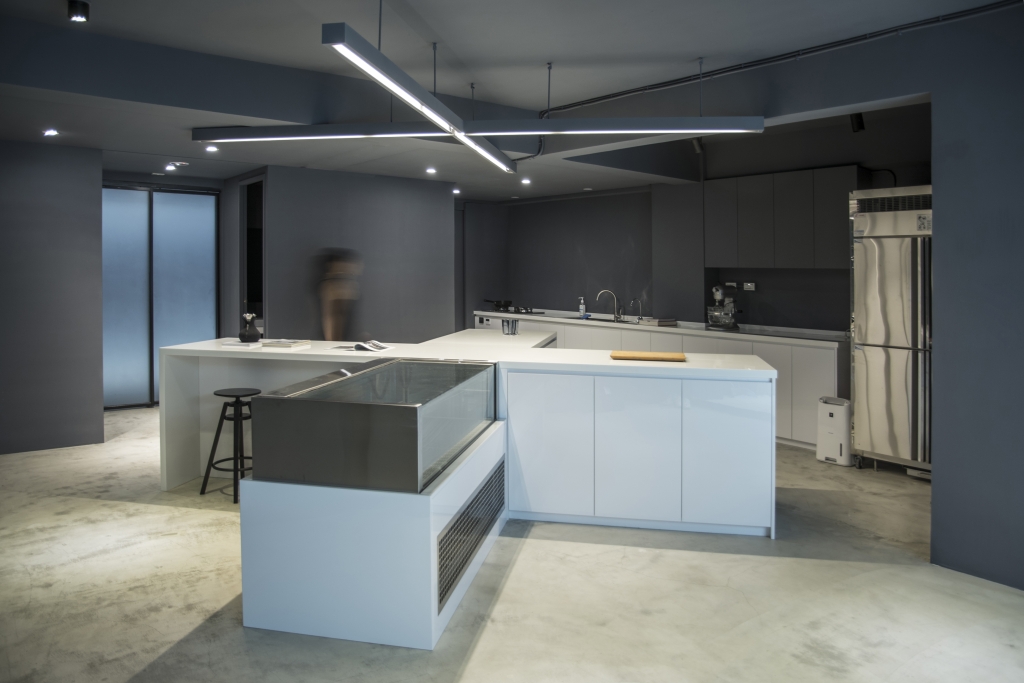
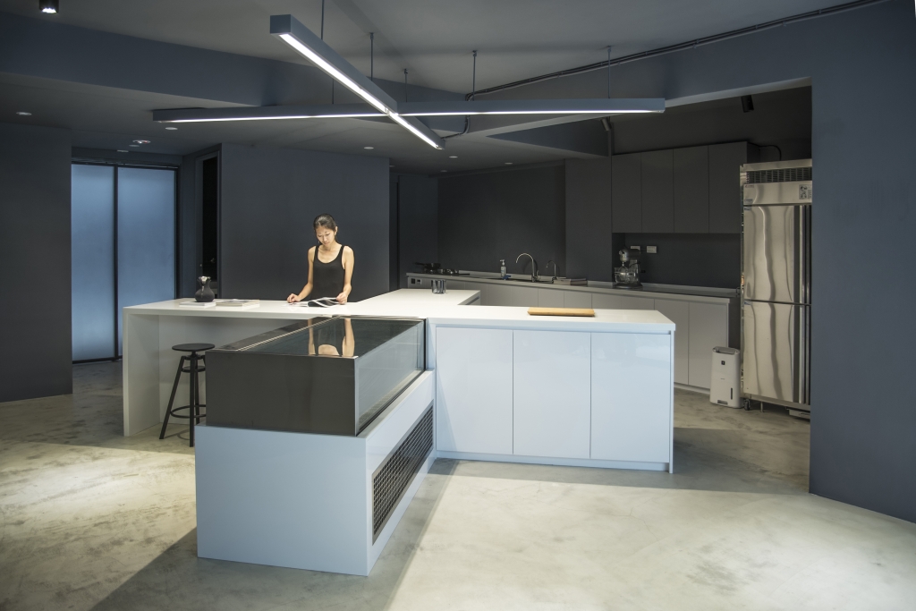
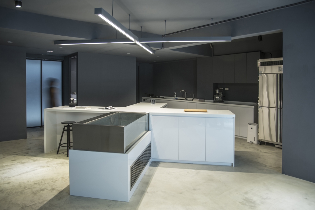
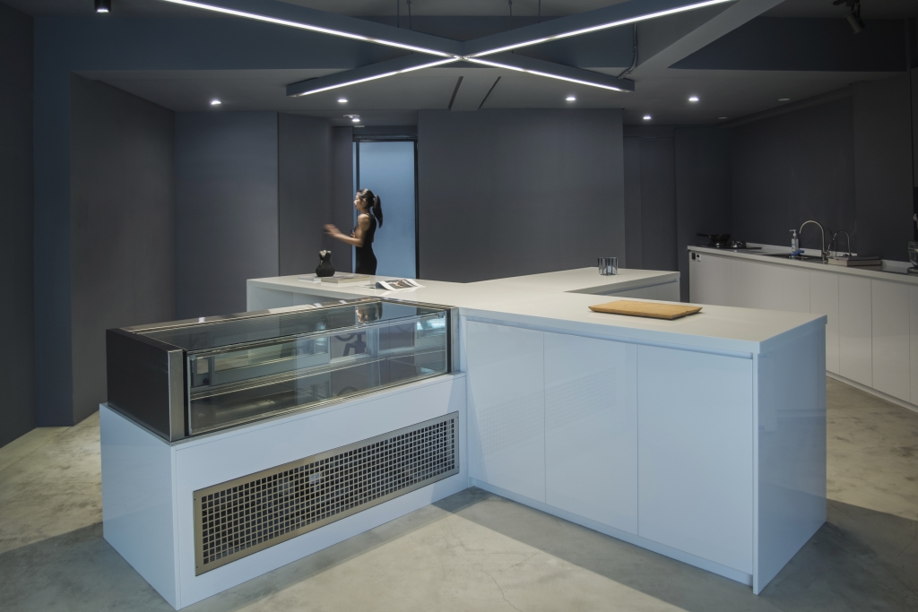
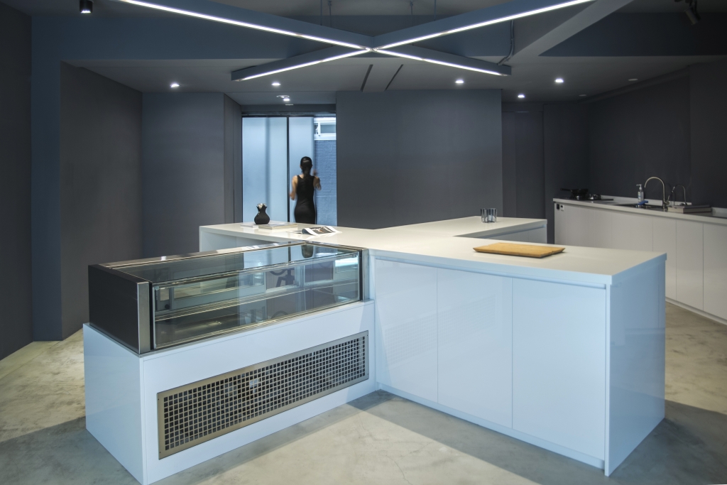
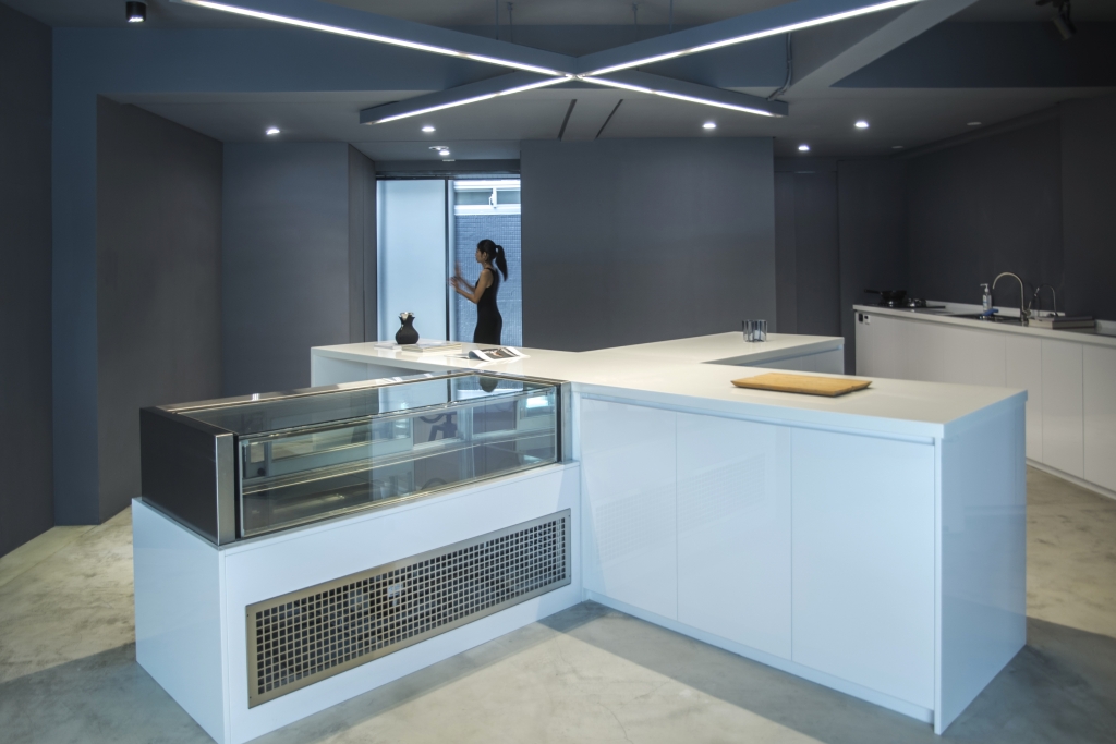
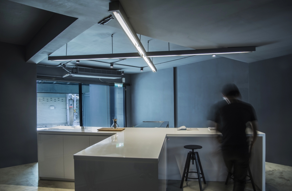
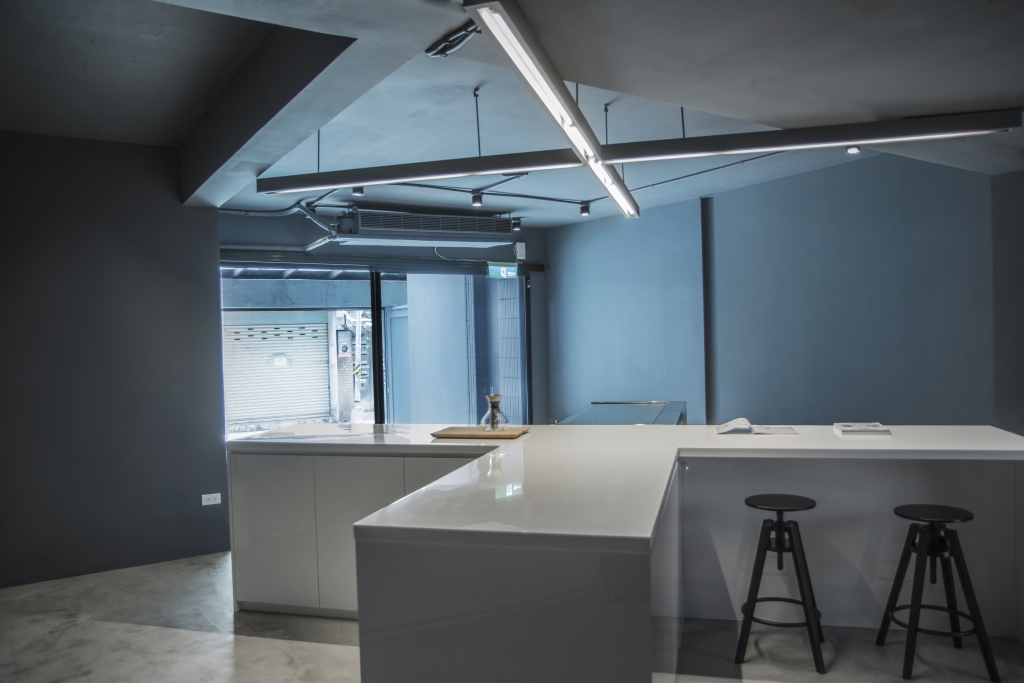
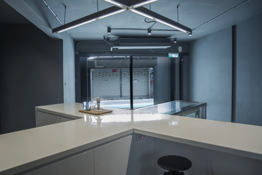
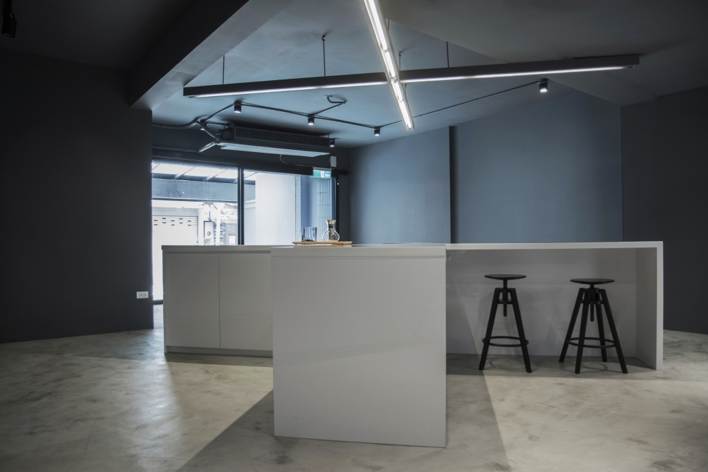
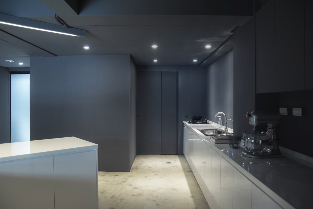
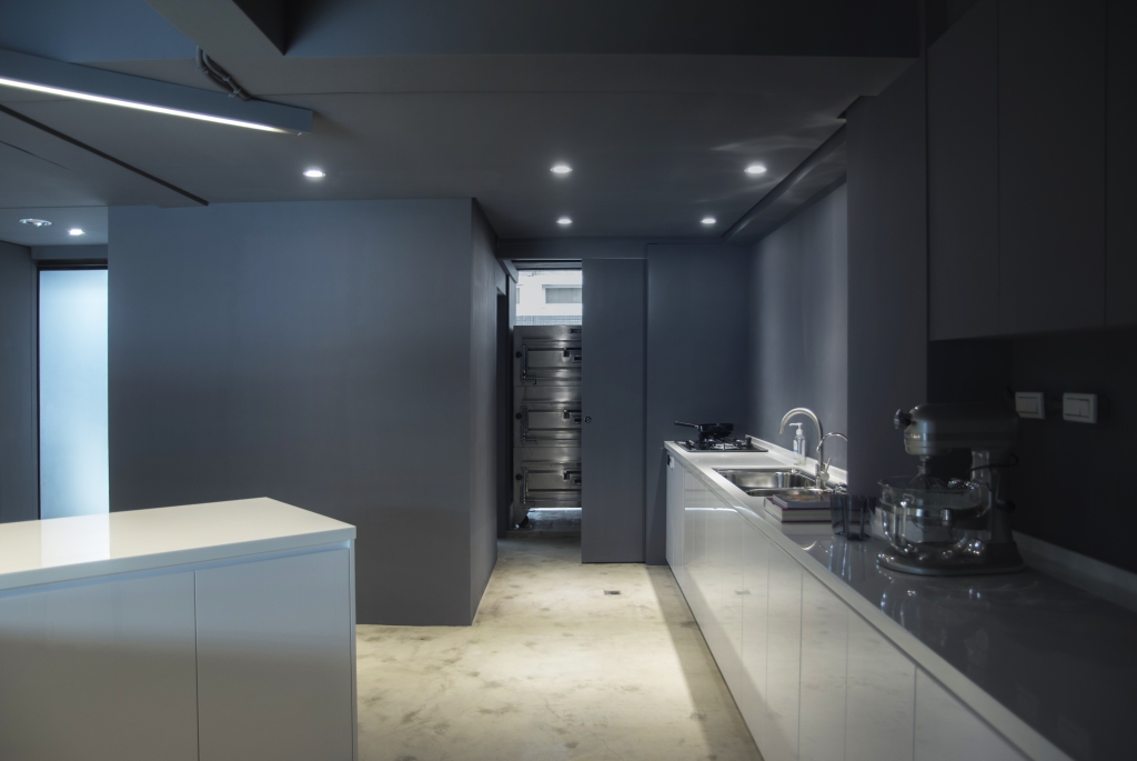
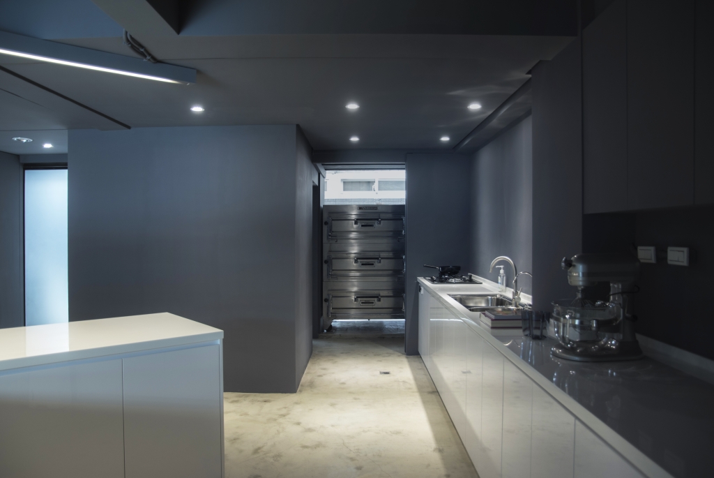
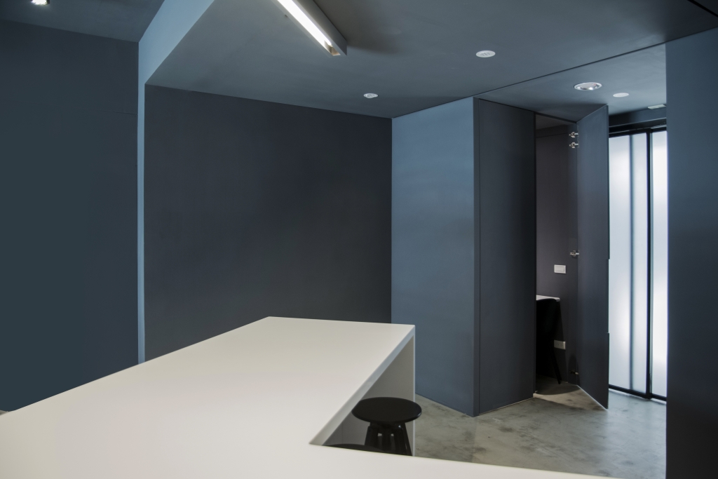
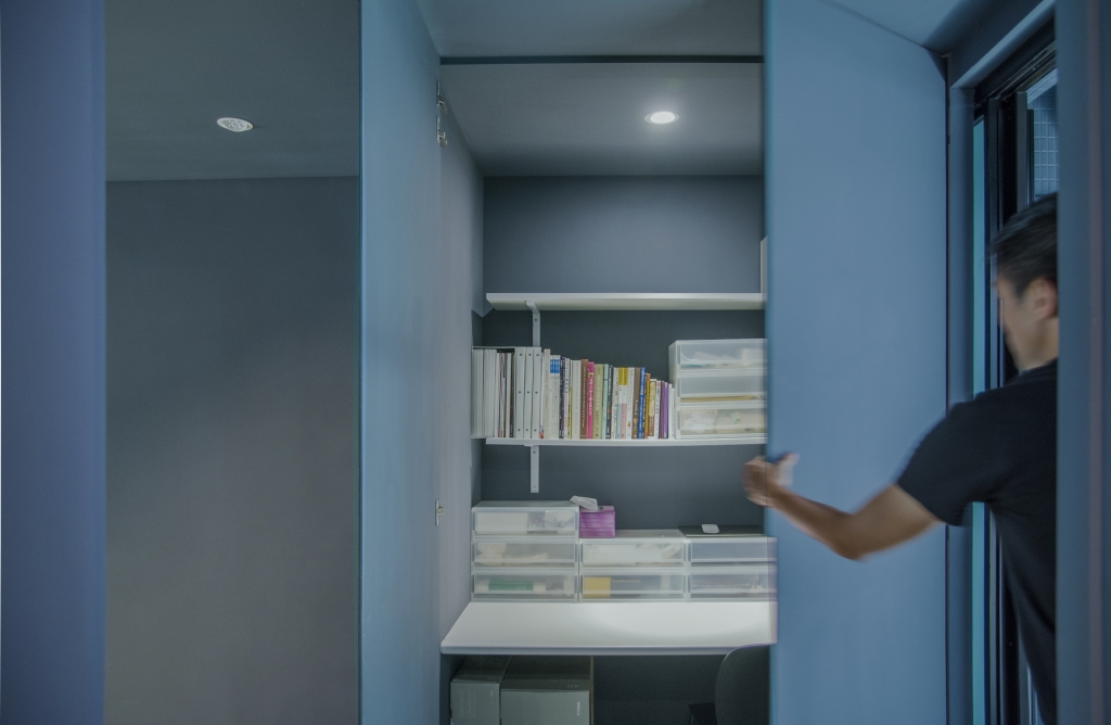
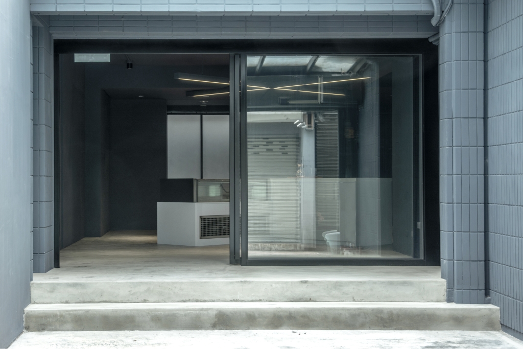
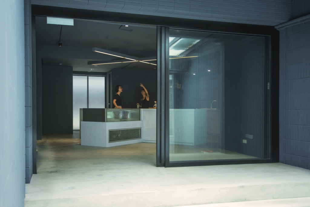
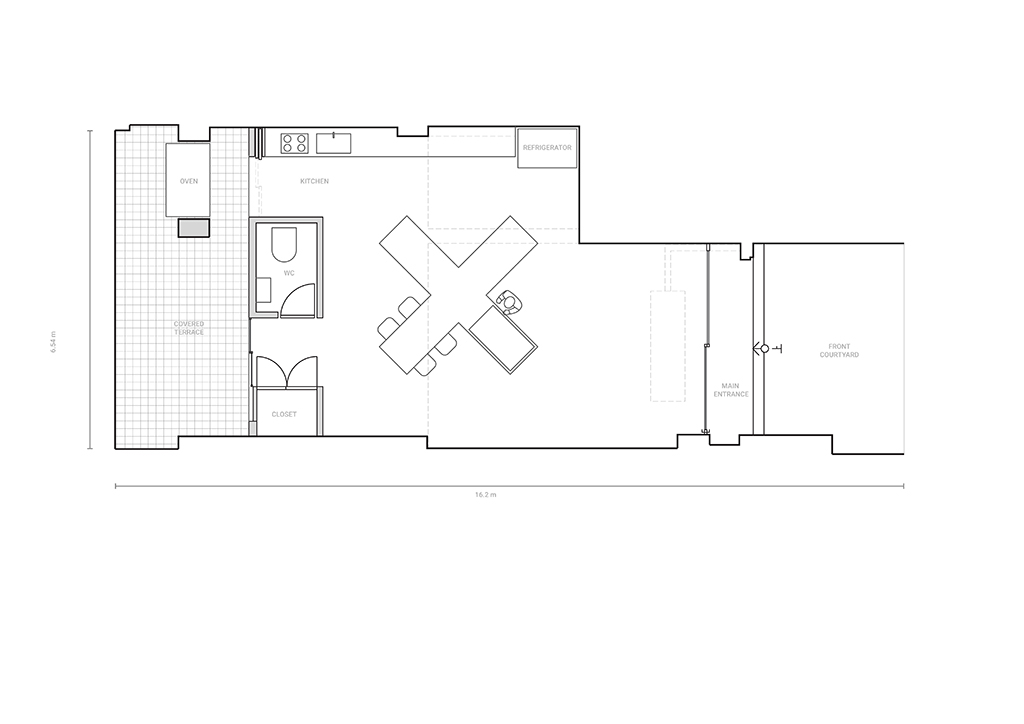
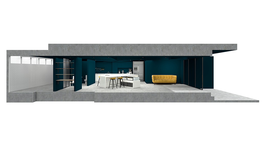
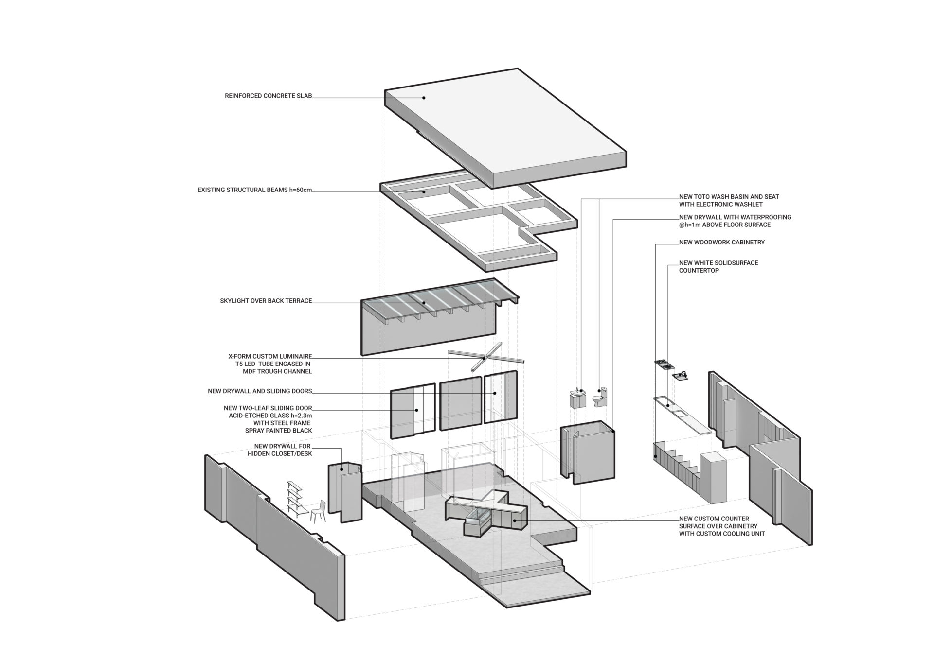
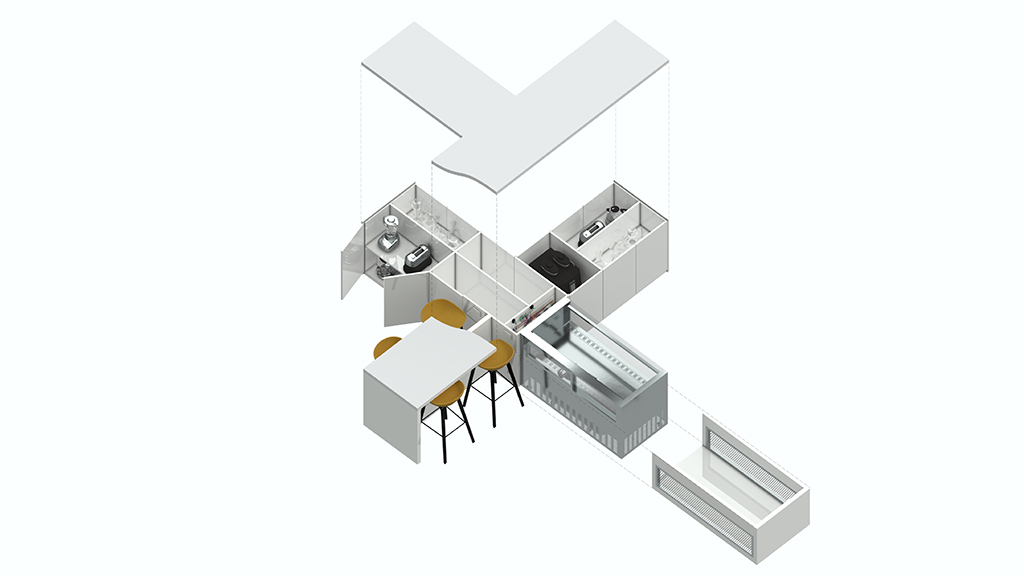
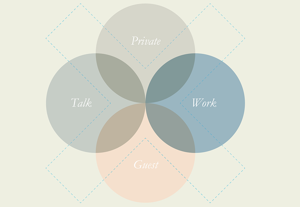
We devised a simple solution by creating an open-plan space with storage and auxiliary functions pushed to side walls. A small office, restroom and industrial ovens are cleverly hidden behind the back walls for maximum privacy and heat isolation, respectively. Sliding doors open to the back courtyard, which receives natural light from a skylight and can be transformed into an additional dining area. An X-shaped countertop structure is designed as a functional yet sculptural feature of the room – it divides the client’s workspace into 4 zones corresponding chronologically with her workflow: discussion tabletop with embedded electric sockets, a dry ingredients zone, a liquid ingredients zone, and a presentation zone with a built-in cake display and glass surface.
The X structure also divides the room into a front and back for guest and Pâtissiere’s spaces, and a left and right for talk and work areas. These overlapping zones define the function of each arm of the X. When the room is used as a classroom, zero transformation is needed, as the instructor takes a position at the center while the students occupy the countertops within an arm’s length of each other. To provide even lighting and add a dramatic touch to the room, a custom-designed LED luminaire in a slender X form hovers above the counter. This lends unity to the space, as well as an iconic and memorable experience for all guests.
CONCLUSION
Oftentimes, the design of retail space is for the consumption of visitors who come and go, while the mess of utilitarian and service spaces are relegated to the back for the employees. We take a more holistic view in designing If Pâtisserie’s space because it is not just for retail service, it is also a creative work studio. The client’s experience is just as important as those she serves, and we believe this is the best way to bring about great design products that are original and timeless.
-
Client
If Patisserie
-
Location:
Taipei, Taiwan
-
Year:
2018
-
Size:
90 m2
-
Status:
Completed
Share project
