The Guggenheim Museum, Helsinki
The Guggenheim Museum, Helsinki
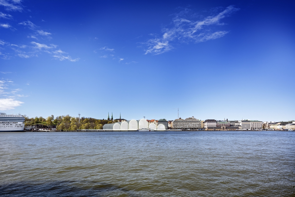
The Helsinki Guggenheim sits in an interesting historical context, whose neighbors are icons around the most important harbor in the city. The new museum adopts a consistent architectural language, but still with a modern language so as to establish its own identity as a new institution for the city. The convergence creates a unique problem: How do you design a museum that react to two directions i.e. the new museum square that face Market Square and Palace Hotel, and the quay that overlooks the heritage of Helsinki’s maritime past? Since the Square and the Olympia Terminal form two major landmarks in the North-South axis, the new museum’s form becomes a natural result of their push forces. This creates a sinosudal wave that lifts to reveal a series of volumes that face the water and park on the East-West axis.

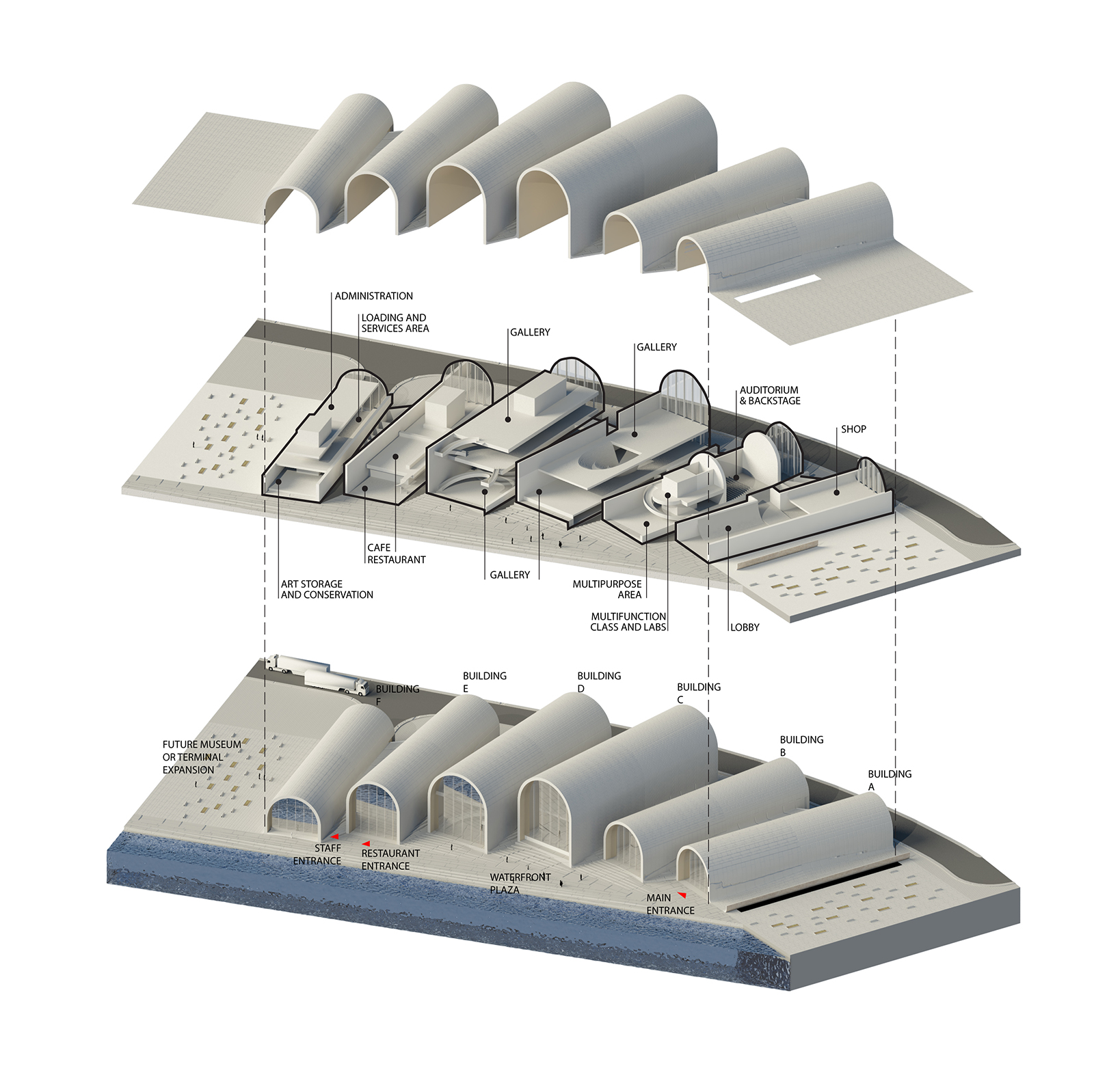
As a large major museum would block views from the park and Palace Hotel, this also addresses the issue of scale. It breaks down into 6 volumes, adjoined at the ground floor to form a functional, contiguous whole. Hence views towards the water are framed, while a small skyline is created when viewed from the north. The building bends to conform to the kinked geometry of the site. This creates a fantastic advantage, where the disparate volumes get pulled apart on the side of the park to increase its open-air condition. Simultaneously it is compressed on the harbor side to create a distinctive silhouette from incoming ferries and boats. In this manner, the museum is the ultimate neighbor when framed by water, park, and the city.
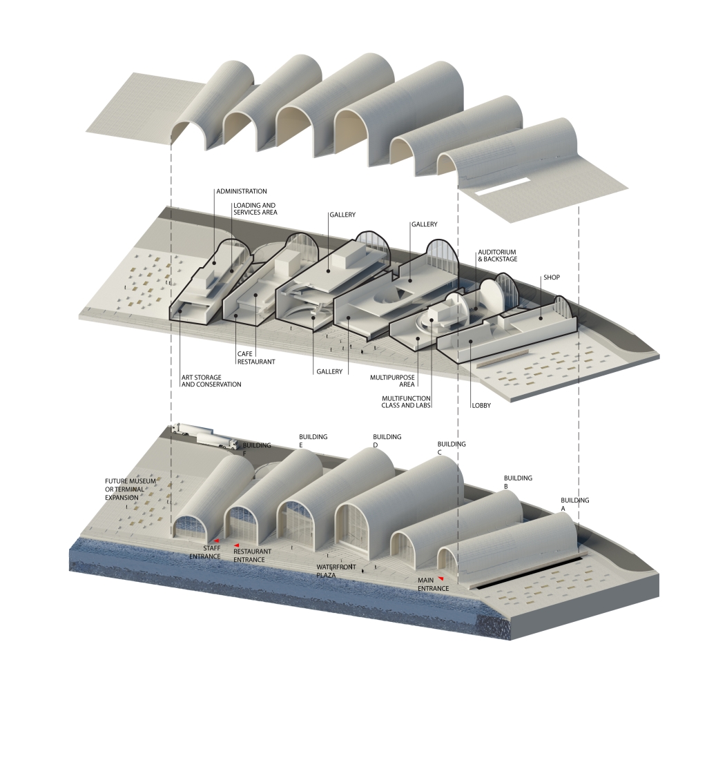
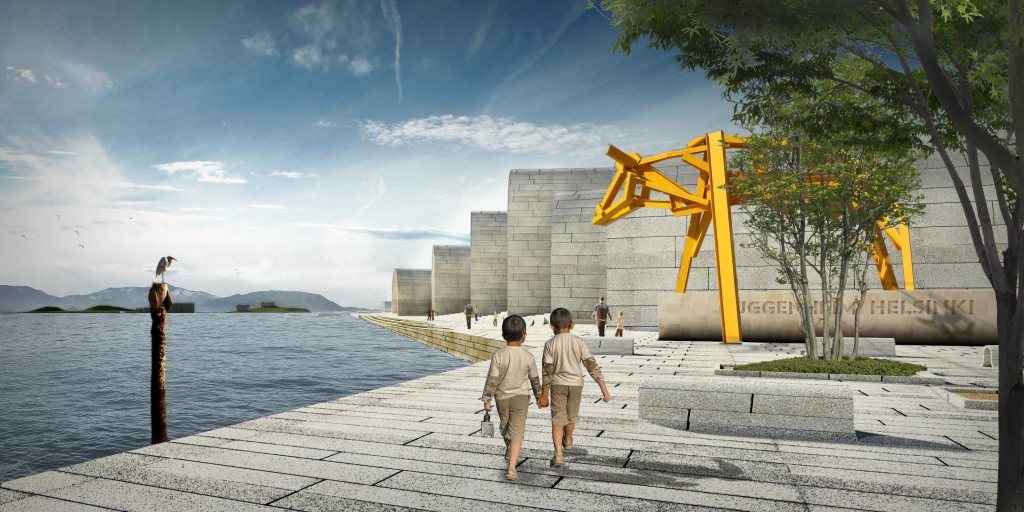
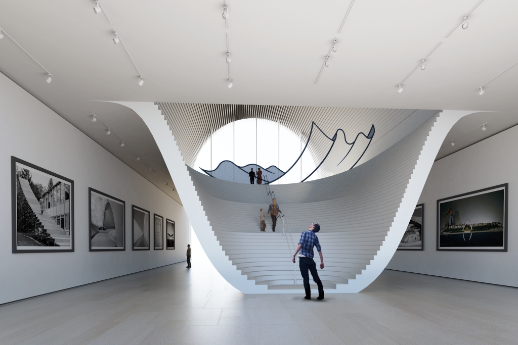
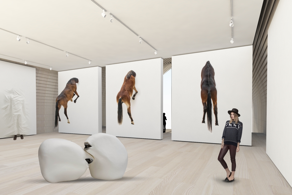
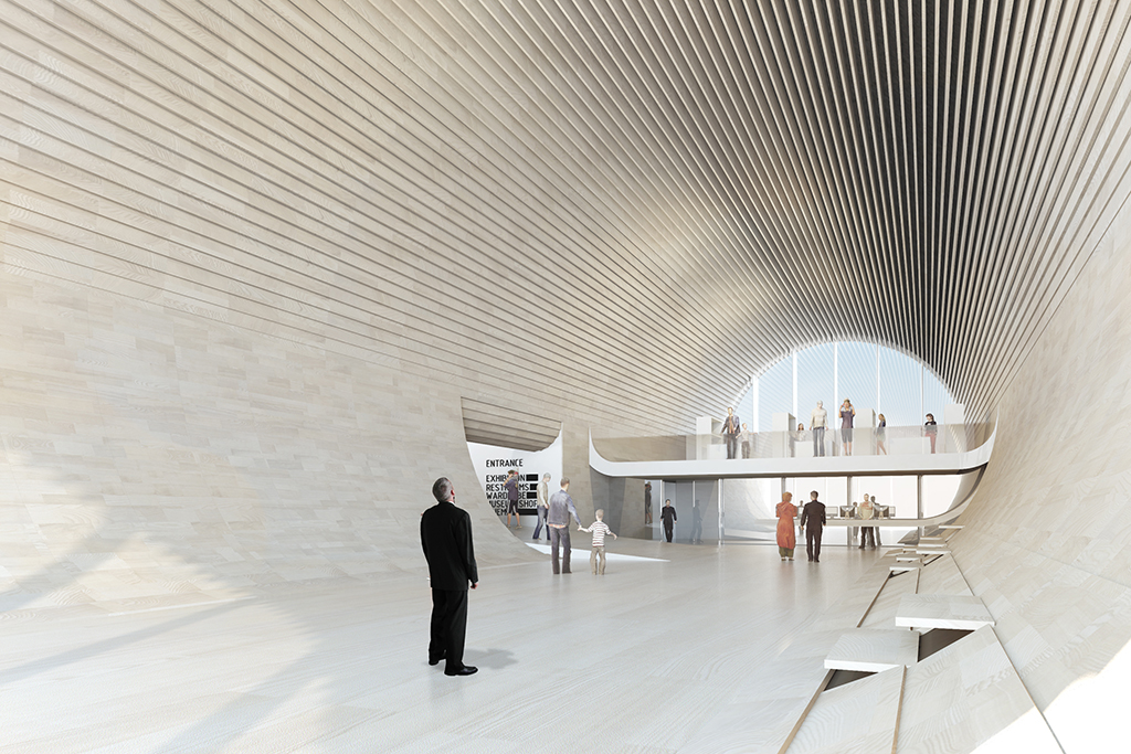
The galleries are designed to be flexible and contiguous for ease of operations. They are combined/separated as needed, connected by a utility tunnel for services and transportation. The galleries are divided into a main hall for site specific installations, and another section for conventional exhibitions. The spaces between volumes can be used for outdoor shows, with natural flow and connection between outside and inside. The lobby is a grand entrance, but also an intimate space with wooden features. They are, at the same time, ceiling light/acoustic diffusers, and wall cladding over services. As it transitions to the ground, it forms a circular profile whose panels can be unfolded to become elevated seating during special performance events. This frames the information and gift shop through a tunnel before transitioning to the galleries. The Performance Hall is directly connected to the lobby. It is designed for flexible use, with ample storage for removable chairs and stages. It is directly connected to the utility tunnel. In special cases, it also has its own direct access to the service road outside via the backstage area. The approach for sustainability, utilities, and structure is conceived as one integral strategy. A key to the design is the arch structure. As modules, they can be pre-fabricated offsite and quickly assembled onsite. The design calls for the elegant Finnish black Korpi granite as an external roof/wall cladding to continue on to the future promenade. It emits a subtle textured grey in the sunlight, and an deep striking black when wet. The interior will be primarily Finnish wood because of its beauty, abundance, acoustic properties, and easy maintenance.
-
Date
August 31, 2014
-
Client
Solomon R. Guggenheim Foundation, Helsinki City Hall
-
Year :
2014
-
Size:
12,100 m2
-
Status:
Competition
-
Location:
Helsinki, Finland
Share project
