By Min Ter Lim, co-founder and creative director of MIIM Office for Architecture
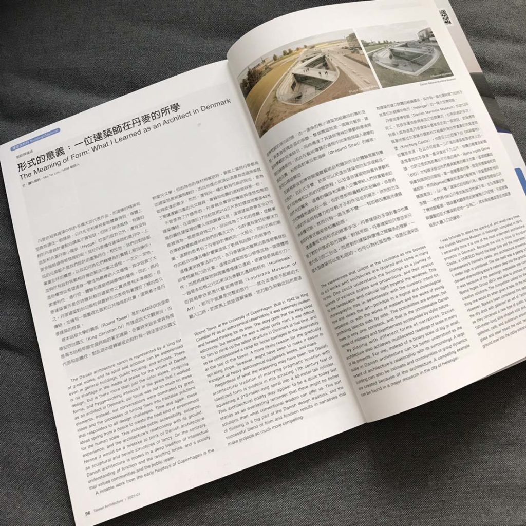
(An abridged version of this essay was published in Taiwan Architecture magazine vol. 304. January, 2021. Below is the full original text of the essay.)
The Danish architecture canon is represented by a long list of great works, and its spirit and ambition can be experienced even in general buildings, public housing, and schools. There is no shortage in the media of praise for the virtues of Danish design, but is there more than just the color styles, intriguing forms, and hygge-evoking interiors? In the years that I worked as an architect in Denmark, our focus was not so much on these elements. Instead, our conversations were dominated by great ideas and the processes of turning them into tractable solutions that responded to all design challenges. Time and again, these ideas spring from a desire to create the best kind of environment for the human scale. This includes public accessibility, entrance, experience, and the architecture’s relationship with its ground. Hence it would be a mistake to think of Danish architecture as sculptural and heroic structures of fancy. On the contrary, Danish architecture is rooted in a deep tradition of intellectual understanding of function and the resulting forms, and a society that values communities and the public realm.
A notable work from the early heydays of Copenhagen is the Round Tower at the University of Copenhagen. Built in 1642 by King Christian IV as an astronomical observatory, it was extremely modern and forward-thinking for its time. The story goes that the King loved astronomy, but because he was a rather portly man, it was difficult for him to climb up the tallest structure in Denmark at that time, and so he commissioned a ramp for horse carriages to the observatory at the top of the tower. A more likely reason for the gradually spiraling slope, however, might have been to make it easier to transport up heavy astronomical equipment, books, and maps.
Regardless of what the reasoning may have been, the Danish architectural tradition of marrying pragmatic function with idealized form is evident in this amazing 17th century feat of squeezing a 210-meter-long spiral into a 40-meter-tall cylinder. This architectural oddity may appear to be a quirk today but stands as an everlasting reminder that there might be better solutions than what conventional wisdom can offer us. This sort of thinking is a big part of the Danish design tradition, and the successful blend of form and function results in narratives that make projects so much more compelling.
This notion of narratives or storytelling is an unseen but powerful element in Danish architecture. Buildings are rarely described as individual objects; instead, it is more compelling to connect the building to its surroundings. A trip to Copenhagen is incomplete without a visit to the Louisiana Museum of Art in Humlebæk, just north of Copenhagen. Upon entering its humble lobby entrance, visitors will immediately understand the importance of curating, placemaking, and closeness with nature as the foundations of this museum’s core ideals. Organized as a series of smaller buildings around a loop and linked by glass walkways, its campus is a perfect synthesis of art, architecture, and landscape. This ensures an intimate and memorable experience at the museum, while conveying the nuances of its highly complex landscape and environment. One may be forgiven for abandoning the art mid-tour to step out into the lush green gardens and gentle slopes that face the Øresund Strait.
The experiences that unfold at the Louisiana as one browses its art works and sculptures are layered and come in many forms. One could understand the buildings as a journey of spaces of various scales and proportions, and their relation to the landscape and natural light beyond the windows. This choreography ties in seamlessly with the curators’ intent for how one views the art—perhaps in a logical and chronological sequence, or with the works of masters and the works of young promising talents side by side. The possibilities are endless, but there is only one constant, and that is the unmistakable Danish sense of intimacy and togetherness surrounded by idyllic nature.
By playing with different forms of narratives, Danish architecture also achieves multifaceted readings of scale in many of its projects. For me, instead of a binary scale of big or small, scale in Danish architecture can be better understood as the extent of architecture’s relationship with its surroundings. A large building can also be intimate and communities or group dynamics are created because of the architecture. A compelling example can be found in a major museum in the city of Helsingør.
I was fortunate to attend the opening of, and revisit many times, the Danish Maritime Museum in Helsingør, completed in 2013. I personally think it is one of the most underrated architectural projects in Denmark. Because the site is close to Kronborg Castle, a UNESCO World Heritage Site and the inspiration for Shakespeare’s Hamlet’s castle, any architectural presence over 1 meter high is prohibited. The site itself was a gaping void of a disused ship-building dock 9 meters deep into the ground. Perhaps it was because of the seemingly impossible site conditions that Bjarke Ingels Group (BIG) was able to produce one of its most creative solutions. The competition called for the most obvious thing one would do when given a hole: fill the hole with a building. However, Bjarke’s team considered this approach of “drowning the dry dock with galleries” an act of “architectural suicide,” and so they conceived a new type of public space by preserving the 150-meter-long ship-shaped void and organizing the museum galleries, café, and auditorium around it. Three giant bridges of glass and steel bisect the void, two of which slope gently from ground level into the lobby entrance.
What followed the architectural design were a series of technological solutions to a major construction problem, many of which were employed for the first time in Denmark: how to keep a 6,000 m2 building and large void below sea level safe from the waters of the Oresund Strait? Engineers and architects devised a solution involving retaining walls and 461 ground anchors that tied the concrete void down to limestone formations beneath the sandy seabed, 40 meters below sea level. This held the museum back from popping up from the ground to float like an empty tub. The enormous void serves as the only hint of the Herculean effort needed to make this architectural masterpiece possible. This space is left raw, unfinished, and exceedingly intimate.
A similar product of architectural and engineering marvel is the CopenHill project, opened recently in 2018. The original competition brief called for a façade design for the largest waste-to-energy (W2E) incinerator in Europe, which BIG saw as an attempt to hide the unsavory aspects of trash disposal. It was obvious to the design team that the project had to be meaningful and relatable to the city of Copenhagen. To do that, they proposed a functional ski slope on the roof, which would not only give the city inhabitants a lovely new public space atop a 25-story-tall iconic building, but also raise awareness about sustainability and trash management in a spectacular fashion. As a show of faith in this outlandish idea, BIG submitted a competition entry that detailed the 500 meters of ski pistes for all trail difficulty ratings across 10,000 m2 of slope, 450 meters of hiking trail through indigenous flora, and a viable plan for public use throughout the year.
Like the Maritime Museum’s artful move of sinking the galleries below ground, CopenHill’s intelligent embrace of functionalism completely transformed the architectural significance of the city. As engineering marvels, the museum echoes the memory of a former Danish naval epicenter since the 1500s, and the ski-slope/W2E incinerator symbolizes the ambition and determination needed to permanently eliminate the threat of climate catastrophe.
To the untrained eye, Danish design is simply “minimalism,” “wood and white,” or “straight lines and soft curves,” and this message can be found in countless coffee-table books and expensive hipster bookstores. This cannot be further from the truth because Danish design culture is a complex amalgamation of Danish societal values and norms. It is not simply the hygge or coziness found in almost all forms of Danish design export, but also a by-product of Jante’s Law, an unwritten social code that considers conformity and social sameness as positive attributes where outstanding behavior is frowned upon. Certainly, Jante is not an enforced law, but those who break it will attract disapproving looks. While its origins are unknown, it may well have arisen from the necessity of uniformity and togetherness among a people to survive Scandinavia’s harsh environment and climate. However, another way to look at this is that Danish society values, above all, an awareness of how one’s own actions may affect others and their well-being. Architects who break from this group to pursue bigger ideas do so with an inherent belief that their quest for innovation would be for the betterment of the public realm. As the great philosopher musician Frank Zappa puts it, “Without deviation from the norm, progress is not possible.” Therein lies the key to the brilliance of Danish design.
————————————
Min Ter Lim is the co-founder of MIIM Office for Architecture in Taipei. He was formerly a project leader architect at Bjarke Ingels Group, Copenhagen, and earned his Master in Architecture I at Harvard Graduate School of Design. He is originally from Kuala Lumpur, Malaysia.


